

Bonnie and crew arrived last February to style and photograph our home. It was a wonderful learning experience and a fun and hectic time.
Here is a look at the pictures of the gathering room that I submitted to Bonnie, so you can see the before pictures.


Here is the shot that went into the magazine!

Bonnie lightened up the bottom shelf and exchanged the glass samovar with the French wine bottle.
She explained that dark objects on the bottom shelf don't show up and she was right!
I have kept it this way and enjoyed changing the flowers or greenery in the bottle.

For this shot, Bonnie lightened up the coffee table and the mantle. She also removed the urn and candlestick from the hearth area. It too has stayed the same with the exception of a pair of iron stools that I placed on the hearth for additional seating.

Note the lamps on the island and the black tole tray over the range.

Following is the shot that was published.

Bonnie felt that the white alabaster lamps were distracting, so we removed them. She also felt the black tray was too dark and we needed a lighter picture. Since the shoot, I have replaced the lamps with a carved wooded lamp, and kept the old oil painting behind the range!

Current island with different lamps!

The dining hall before the shoot!

The magazine shot!

One of my favorite pictures in the magazine.
I love the way Bonnie tossed the ranunculus petals on the table surface!

Another shot from the dining room hutch. This is the final picture in the magazine.
Bonnie added the flowers and grapes for the photo. I loved it!

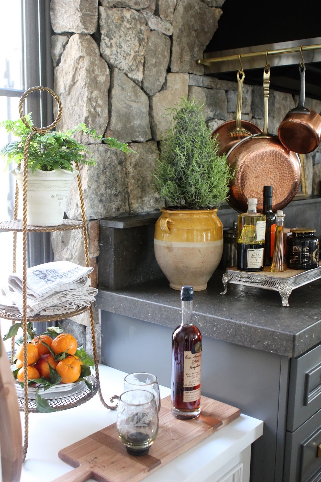
My submission picture for the prep kitchen (larder).

The magazine picture- brighter and more interesting with the cart pulled into the center of the room instead of against the window.
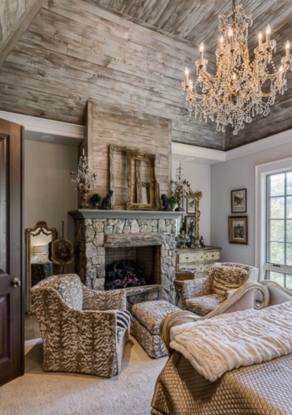
The master bedroom before shoot!

Bonnie removed the black cherub statues and replaced them with a simple bouquet of queen annes lace. The fur throw on the bed was replaced with a cashmere throw. She added the pink pillows for a pop of color.

Magazine shot-

Master bath in the magazine article

Here are some rooms that did not make the magazine.

The sunroom didn't make the cut!

Neither did the powder room

or the elevator

or the entry

or this great vignette styled by Bonnie.

or one of my favorite things in the house- the front door!

Bonnie Broten editing my stuff- a hard task!

Bree Williams the photographer and her wonderful assistant - Charlene

Bree lighting the candles for the table shot!
As it was February in the mountains of North Carolina, landscaping was a challenge.
Our wonderful team from Dream Escapes dug holes in frozen ground and put in hellebores and heather. Camelia bushes were planted too!


This was a wonderful experience. I am thankful to have had the privilege of working with these very talented ladies for several very cold days in February. It was a memory that I will cherish forever and I am very pleased to see the results in print!

Here's to Country French in the mountains of North Carolina!


